Chapter 9. User Interface Components
Rich Text Editor
Fakoli provides its own implementation of a Rich Text Editor, implemented in MooTools. The most common way to use this control is as a field in an AutoForm. To do this, simply specified the data type for that field to be HTML in your data model:
"description" => HTML,
The data model control looks like this (by default):
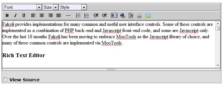
The control can be customized in a number of ways. You can disable the styling bar (font, size and style) if you don't want your users to have that level of control over the text formatting (although advanced users can always use the view source view to enter HTML directly). Also your application can register buttons to be displayed on the RTE toolbar. In the example above the last two buttons on the toolbar are custom buttons registered by Fakoli/CMS using this mechanism, to allow users to easily insert links and images managed by the CMS.
One useful feature provided by the Rich Text Editor is the automatic stripping of unnecessary and/or badly formed HTML markup when text is pasted into the control from a word processor (yes, I'm looking at you Microsoft Word). This helps keep the site's look and feel consistent while still allowing interaction with common desktop tools.
For HTML experts, or users who wish to adjust the markup of their content, the View Source checkbox provides access to the HTML source.
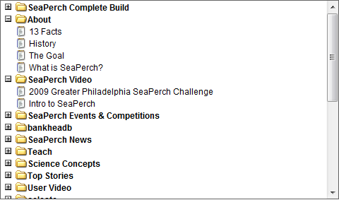
Tree Control
The tree control provided by the Fakoli framework is a highly flexible multi-purpose mechanism for displaying, navigating and selecting from hierarchical data sets. The example below shows how a simple single select tree can be used to display a list of articles grouped by type (if you are using Fakoli/CMS you can see this code in action when clicking on the Articles tab in the Insert Link or Document popup in the Rich Text Editor):
$articlesByType = GroupedQuery::create(Article, "ORDER BY title", "article_type")
						->execute();

$tree = new TreeControl("articles");
$tree->width = "100%";
$tree->height = "280";
$tree->selectMode = "single";

foreach($articlesByType as $type => $items)
{
	$typeNode = new TreeNode($type, $type, null, false, "tree_node_closed", "tree_node_open");

	foreach($items as $item)
	{
		$itemNode = new TreeNode("{$type}_{$item->article_id}", $item->title, null, false, "tree_node_closed", "tree_node_open", "javascript:insertLink(\"/article?article_id={$item->article_id}\")");
		$itemNode->leafStyle = "file_node_leaf";
		$typeNode->add($itemNode);
	}

	$tree->add($typeNode);
}
This tree would be rendered as shown below:
The Tree Control can be used in a number of ways:
Selection
You can use the tree control within a form to provided hierarchical selection. There are two basic selection modes (specified by the TreeControl::selectMode field):
- single – in this mode only one item can be selected at a time. Each selectable item gets a checkbox, but clicking on a checkbox clears the checkboxes for any other selected item. The value of the selected node is returned when the form is posted.
- multi – in multiple select mode, a checkbox is displayed next to each selectable node. The user can select as many as desired. The value is returned as an array of values when the form is posted.
Navigation
You can use the tree control as a navigation control quite easily. When working in this mode, you simply assign a URL to the TreeNode::link property for each navigable tree node. Clicking on the node will then navigate the user to that URL. You can also assign a target frame, window or iframe to the TreeNode::target property to have the link open in a different target (this can be useful for implementing 'explorer' style navigation).
Load on Demand
One especially useful feature that the tree control provides is the ability to load branches on the tree as required. To do this, set the TreeNode::onDemand property for the tree node at the top of the branch to the URL of a PHP script that will generate the tree fragment below that node. The TreeControl::writeNodes() method can be used to generate tree fragments. To use it, construct the TreeControl object and populate it with TreeNodes for your branch. Then instead of calling TreeControl::writeHTML(), call TreeControl::writeNodes(). This will output the HTML for the nodes, without the surrounding tree structure or supporting JavaScript (which will already be in place, thanks to the loading tree).
Note also that you do not have to use the TreeControl to supply the on-demand HTML fragment. In fact, any valid XHTML fragment will do, and will be displayed within the tree.
Styling the TreeControl
All aspects of the TreeControl's user interface can be styled via CSS. The default tree styles are contained in the /fakoli/css/tree.css file. Styles are provided for branch nodes and leaf nodes, and provide support for indicating file types via icons. You should find it fairly easy to derive your own styles from the format in this file.
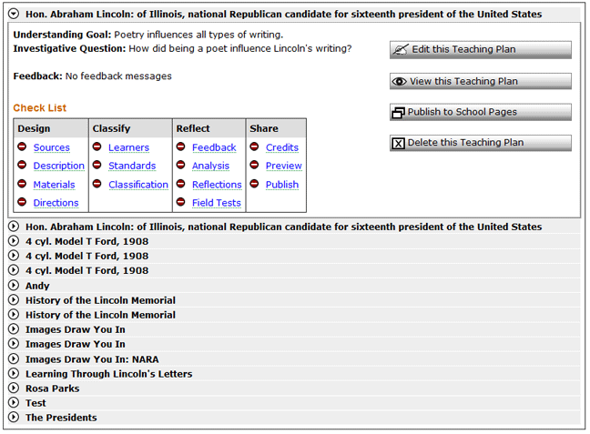
Using CSS it is possible to have the TreeControl look entirely different from a standard tree, and when combined with the load-on-demand HTML fragment feature this opens up the possibility to easily create complex compound user-interface controls. The example shown below is a TreeControl used in such a way to provide a series of expandable status boxes.
Directory Tree Control
Tab Bar
Tab Bars provide a way to separate out complex forms or workflows over a series of screens. The Fakoli TabBar component makes this easy to implement, with the look and feel being styleable via CSS. Many examples of the TabBar control can be found in the Fakoli/CMS source code. The following code snippet sets up the tabs on the Components page:
	$tabs = array("Components"		=>	"/admin/components",
				"Component Pages"	=>	"/admin/component_pages"
					);

	$bar = new TabBar("tabs", $tabs, "");
	$bar->useQueryString = false;
This sets up the TabBar object. The script then calls TabBar::writeHTML() to render it at the appropriate point in the HTML output. The result is shown below:

This is the simplest form of TabBar. The current tab is indicated by graphical emphasis (dark blue in the above image). Clicking between the tabs will navigate to associated pages. Each of those pages must create the TabBar control with the same data and settings (generally done by including a common file that contains the TabBar creation code).
The TabBar::queryString property defines the common query string fragment that is passed along with all the clicks on the TabBar tabs. In the above example the TabBar::useQueryString property is set to false, so the queryString property is ignored. Often, though, it is used to pass through the primary key of the parent data model object for a set of tabs.
If the queryString property is being used and no query string is provided, then all the non-current tabs are disabled to prevent the workflow from progressing without the initial tab being completed, as shown below:

Two-Level Tab Bar
One problem that occurs often with web applications is to organize a large number of data-entry screens for complex objects. These can be split across tabs, up to a point, but once the tabs become too numerous usability starts to suffer. The Two-Level Tab Bar groups tabs into a two-level hierarchy while maintaining the overall behavior of a regular Tab Bar. An example of the Two-Level Tab Bar is shown below:

Two-Level Tab Bars are created in much the same fashion as regular Tab Bars, the only difference being in the structure of the array defining the tabs:
$tabs = array("Gallery" =>
              array("Definition"  => "/admin/image_gallery_form",
                    "Permissions" => "/admin/image_gallery_permissions"),

              "Images" =>
              array("Thumbnails"    => "/admin/images",
                    "Detailed List" => "/admin/image_list")
	);

$qs = ($key) ? "gallery_id=$key" : "";
return new TwoLevelTabBar($tabs, $qs);
Data-driven Tab Bar
This control is useful for displaying a tabbed interface based on the results of a database query. A great example of this is the Application Settings page in the Fakoli CMS Admin section.
Wizard Bar
Ajax Popups and Dialogs
Simple Popups
Modal Dialog
Floating Dialog
Progressive Search
Chapter 10. Miscellaneous Framework Features » « Chapter 8. List Views